Empowering Software Engineers and Product Teams in Data Visualization Design
Data visualization is a cornerstone of modern application design, allowing users to quickly understand complex information at a glance. However, the effectiveness of a data visualization depends heavily on its design principles. For software engineers and product teams, being armed with these principles is essential not only for creating impactful visualizations but also for having the confidence to push back on designs that may not serve their users well. Let’s dive into the main principles of data visualization design within applications, focusing on interactivity, calls to action, and prioritizing what to highlight.
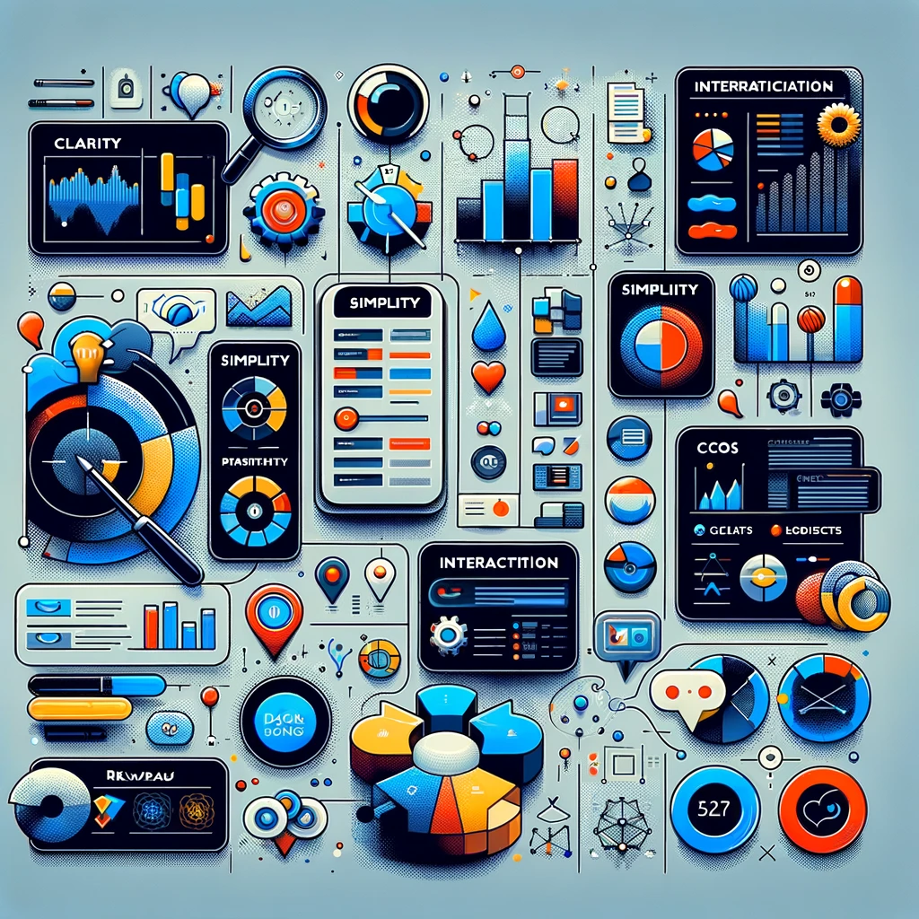
1. Clarity and Simplicity
Above all, a visualization should make the data easier to understand, not more complicated. This means avoiding clutter, using clear and readable fonts, and making sure that the choice of colors and shapes enhances understanding rather than detracting from it. Simplify where possible, and always ask whether each element of your visualization serves a clear purpose.
2. Consistency and Standards
Consistency in design helps users understand your visualizations more quickly. Use consistent color schemes, shapes, and icons across your visualizations to represent similar types of data or actions. This also applies to interactivity; for example, if clicking a bar in one chart drills down into more detailed data, the same action should have the same result in all other charts.
3. Prioritize What to Highlight
Not all data is created equal. Prioritize information based on its relevance to the user’s goals and tasks. Highlight key findings, trends, and outliers using techniques like color, size, or placement. However, be judicious in your use of these techniques; overemphasizing too many points can lead to a cluttered and confusing visualization.
4. Interactivity
Interactivity can greatly enhance the utility and engagement of a data visualization. It allows users to explore the data in a way that’s meaningful to them, uncovering insights that static visualizations might miss. Consider adding features like:
- Drill-downs to reveal more detailed data
- Tooltips for additional context on hover
- Filters and selectors for customizing views
- Zoom and pan capabilities for large datasets
Ensure that interactive elements are intuitive and clearly indicate their function.
5. Effective Use of Color
Color is a powerful tool in data visualization, but it’s also easy to misuse. Use color to draw attention to key data points or to distinguish between different data categories. However, be mindful of color blindness by choosing palettes that are accessible to all users. Additionally, avoid using too many colors, as this can lead to confusion.
6. Calls to Action (CTAs)
A visualization should not only present data but also guide users on what to do with the information. Effective CTAs might encourage users to explore the data further, make a decision, or take a specific action based on the insights provided. Place CTAs prominently but unobtrusively, ensuring they are relevant to the data being displayed.
7. Responsive and Accessible Design
Data visualizations should be accessible and readable on any device. This means designing responsive visualizations that adjust gracefully to different screen sizes and orientations. Additionally, ensure your visualizations are accessible to users with disabilities, incorporating features like keyboard navigation and screen reader support.
8. Testing and Feedback
Finally, the design of data visualizations should not happen in a vacuum. Regular testing with real users can uncover issues with readability, usability, and interpretation that you might not have anticipated. Use this feedback to iterate and improve your visualizations.
Conclusion
Empowering software engineers and product teams with the principles of effective data visualization design is critical for creating applications that truly serve their users. By focusing on simplicity, clarity, interactivity, and user-driven design, teams can not only enhance the user experience but also feel confident in pushing back against designs that don’t meet these standards. Remember, the goal of data visualization is to illuminate, not confuse. With these principles in hand, your visualizations can become powerful tools for insight and action.